Mental health waiting times shoot up
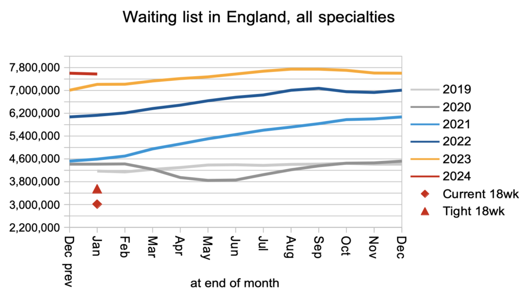
The English referral-to-treatment (RTT) waiting list shrank modestly (by 27,800) to 7.58 million patient pathways in January, according to the latest data from NHS England. These are the last figures before tens of thousands of patients disappear from the statistics in February, as a result of NHS England excluding community services from the reported RTT data.
The NHS’s next target is to eliminate 65 week waits by the end of March (although there are rumblings that this target may be pushed back, in which case the figures would not come out until after the general election). There was some progress in the right direction in January as the number of over-65-week waiters fell by 6,000 patient pathways to 92,000. However the already-missed targets to eliminate over- 104 and 78 week waits went in the wrong direction, with numbers increasing by 94 (to 376) and 849 (to 14,000) patient pathways respectively.
In the following discussion, all figures come from NHS England. You can look up your trust and its prospects for achieving the current waiting time targets here.
The numbers
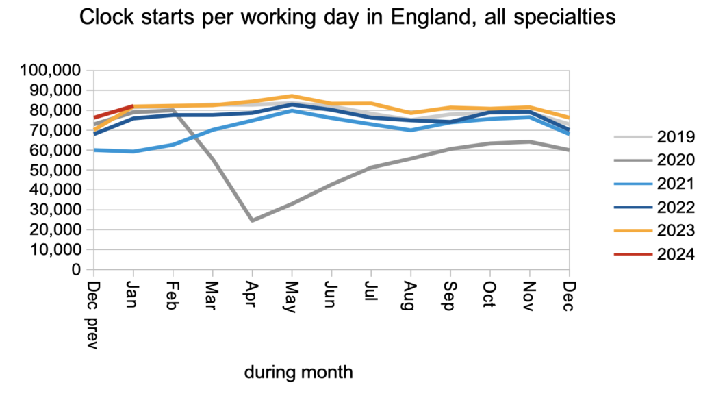
The demand for elective care, as measured by the number of patients starting new RTT ‘clocks’, remained slightly above pre-pandemic levels.
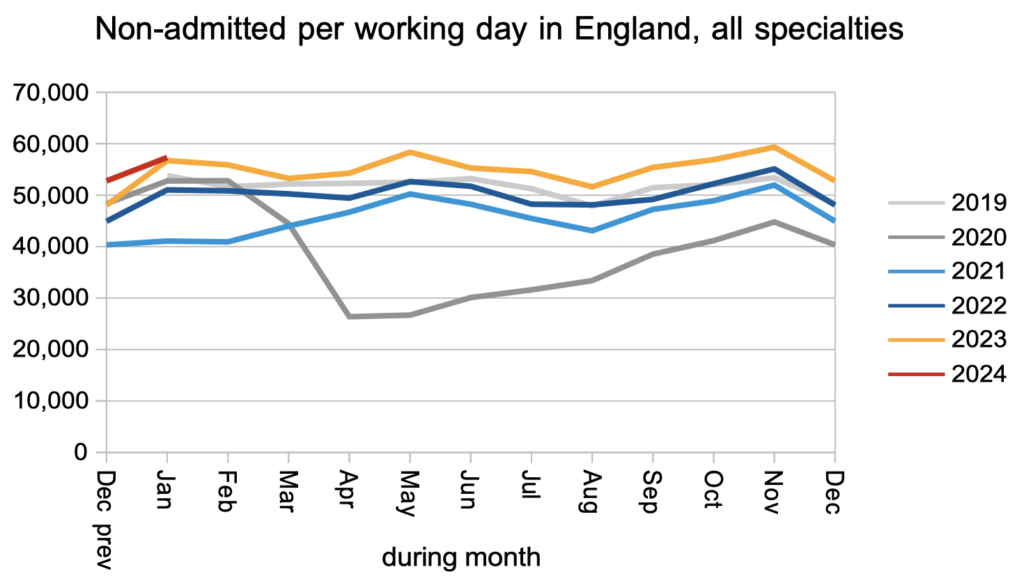
The number of patients leaving the waiting list following an outpatient appointment, or for any reason other than being admitted for treatment, remained significantly above pre-pandemic levels.
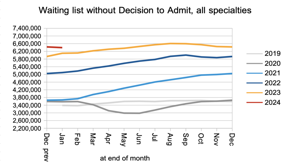
The net result of those clock starts and non-admitted clock stops, plus those patients converting to the waiting list for admitted treatment, was that the number of patients waiting without a ‘Decision to Admit’ fell slightly. This is our best available indicator of the waiting list for diagnosis and decision, and a fall is good news. These patients include an estimated 27,199 patients who are not currently suspected of having cancer, but for whom that will be the eventual diagnosis.
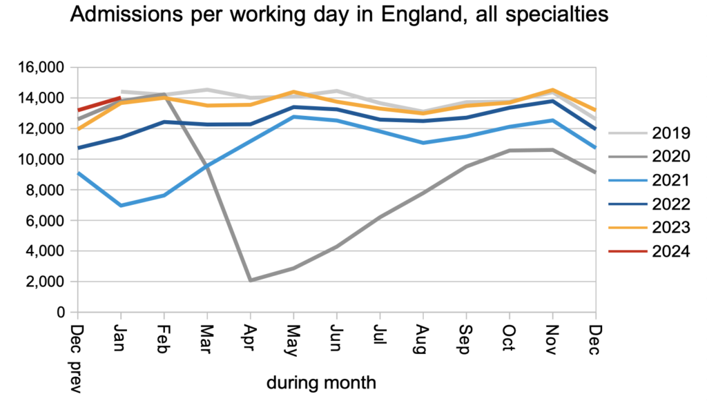
Patients were admitted for inpatient and daycase treatment at close to pre-pandemic rates.
The net result of all those clock starts and clock stops, plus the 10-15 per cent of clock starts that routinely go missing from the data every month, was that the RTT waiting list shrank slightly. This conforms to the usual seasonal pattern when the waiting list is broadly stable.
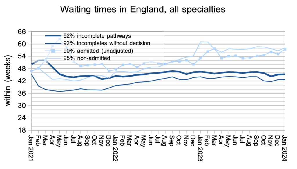
What matters to patients is how long they will wait, not how many others are waiting alongside them. The typical RTT waiting time increased slightly in January from 45.15 weeks to 45.27 weeks. In April 2013 it was just 15.8 weeks.
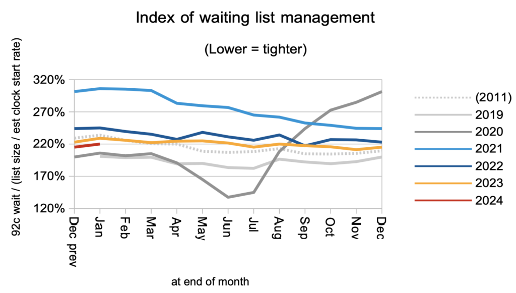
Waiting times are a function of both the size and shape of the waiting list. The shape of the RTT waiting list is recovering slowly but remains significantly worse than pre-pandemic.
Mental health waiting times are shooting up and, if this continues, will soon be the longest specialty-level waits in the NHS.
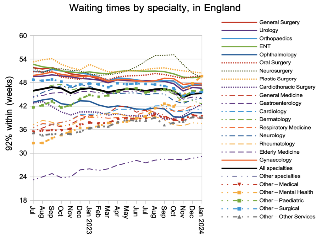
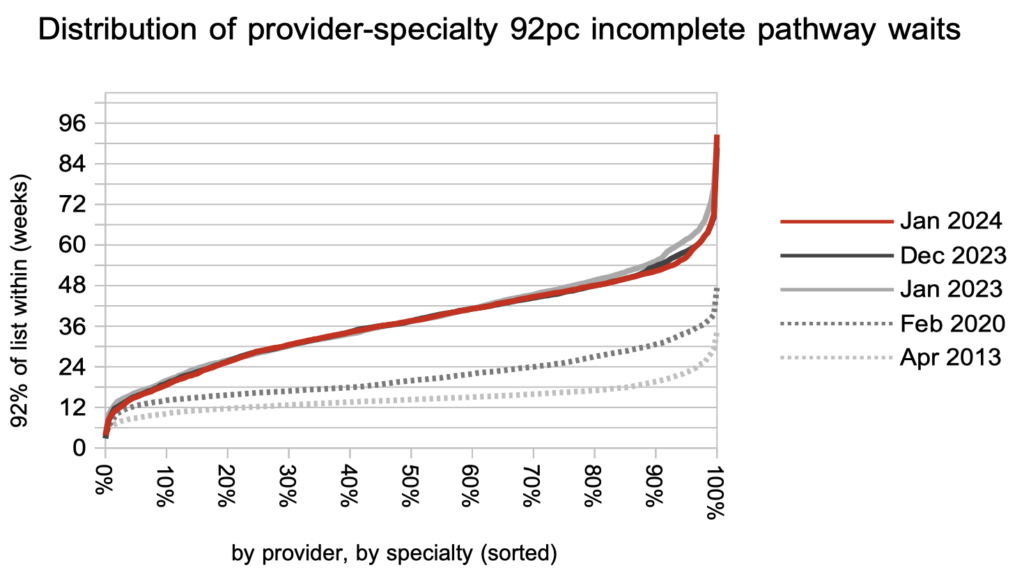
Looking at nearly 3,000 local specialties in hospitals across England, the longest waits are coming down while the rest of the picture has remained static for the past year. Waiting times generally remain much, much longer than before the pandemic.
Referral-to-treatment data up to the end of February, which will have community service waiting lists excluded for the first time, is due out at 9:30am on Thursday 11th April.
