How to use Report Editing in Gooroo Planner
12/12/2012by Rob Findlay
Gooroo Planner has always been good at bulk analysis: load up dozens or even hundreds of service lines, and it will rip through them in a matter of seconds and do all your planning for you. That means you can generate scenarios rapidly, across your whole hospital or health economy, covering all the different activity or performance scenarios you want to investigate.
But sometimes you want to dive into one particular service – usually a big one like medical emergencies or orthopaedic electives – and tinker. What if this was our waiting time target? What if our length of stay was that? If we did some extra outpatients, what would be the knock-on effect for inpatients? In a situation like this you want to be able to fiddle around with the numbers, try this change and that change, and just see what happens. Not so easy when the calculations are all run in batches, but dead easy with the new report Editing screen.
You can find video tutorials about editing reports in our video section.
When you’re in the main Report view, there is a link above each service called “Editing”. Click it, and now you can tinker and mess with the data, a service at a time, and see instantly “what would happen if…”. Like the week-by-week profiling screen, it’s designed to be easy to use by operational managers and anybody else whose job isn’t necessarily heavy on spreadsheets and databases. Information and planning analysts can load up the main data, and perhaps run the main report too, and then let operational managers seek out that sweet spot between waiting times targets and available resources.
In this example, the services in your model have been described using three headers: hospital site, specialty and admission type; the models you use in real life may have fewer or more headers than this. In this example the service you want to pick is orthopaedic elective inpatients on the main hospital site. So use the left hand drop-down to select the main site, then click the Specialty button above it to change the drop-down to show specialties, and use the drop-down again to select orthopaedics, and finally click the Admission type button and then use the dropdown to select elective inpatients. When you’ve selected a unique service, the “Run Editing” button appears, so click that.
If this is your first time using Editing, you’ll need to choose the dataset fields (i.e. the data going in) and results fields (i.e. the results coming out) that you want to look at, using these two drop-downs:

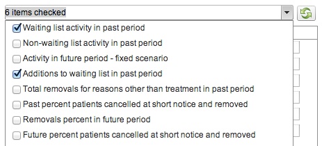
You can select as many fields as you like from each list by ticking them. For instance your dataset drop-down might look something like this when you’re selecting the data you want to change:

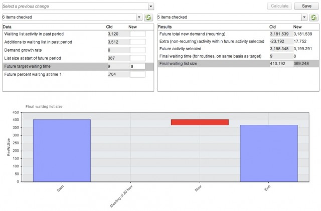
When you’ve finished selecting dataset and results fields, click the “refresh” button (with the green arrows on it) to update the display. Then, depending on which items you’ve selected, you might see something that looks a bit like this:

Now you’re ready to start tinkering with the numbers. You can enter new values in the “New” boxes in the left-hand (Data) section and, when you click the “Calculate” button above the Results section, the new results values will appear under Results. You can also click any line in the Results section to see a waterfall chart showing the effect of successive changes on the result you chose.
It’s worth remembering that everything is calculated using this report’s existing Calculation Settings, including the activity scenario that determines whether future activity is going to carry on at the past rate, or match demand, or achieve targets, or achieve some other objective. So for instance, here we have changed the target waiting time from 9 weeks to 8 weeks, in a report where the activity scenario was set to achieve the waiting list targets; we’ve chosen the list size as the value to display on the waterfall chart:

You can see that changing the waiting time target has reduced the list size required to achieve that target (the red column shows that the list size has reduced). But what (you may be wondering) is the blank space on the chart labelled “Meeting of 20 Nov”? That is there to show what happens when you want to save a bundle of changes that you’ve made. If you click the “Save” button then the changes you have made are written back to the Report, and you can create an audit log describing the change. This audit log helps you keep track of successive changes if, for instance, you are tracking the negotiation between a commissioner and provider, and whatever you enter as the title of the audit log appears on the axis of the waterfall chart. You can revisit previous changes using the “Select a previous change” drop-down (see the top of the previous image); it is clear from this waterfall chart that, whatever was decided on 20 Nov, it did not affect the list size.
If you don’t want to save the changes you’ve made then just change the service selected, or use your web browser to navigate away from this screen. Changes are only written back to the report if you click Save (and the original dataset is never changed at all by the Editing screen). Similarly, your selection of displayed dataset and results fields is only saved when you click Save, so if you change your selection temporarily and don’t want it preserved for your next visit then just don’t click Save.
That’s pretty much it. One more thing… if you are editing a report that has knock-ons switched on (so that, for instance, increases in outpatient activity are reflected in increased demand for elective services) then changes to one service may affect the results for another service. Those knock-on effects won’t be immediately visible on the Editing screen, but a warning that this may happen will appear in the audit log, and you can always see the knock-on effects either back in the main reports view or by editing the affected service.
Return to Post Index