Managing winter pressures, week by week
10/10/2012by Rob Findlay
Let’s take a look at how week-by-week profiling can help acute providers with winter pressures. We want to maximise capacity utilisation, and minimise the risk of bed crises, cancellations, and 18-week breaches.
We’ll take it in two stages:
1) Preparing for winter: We will look at how emergency and urgent elective demand are likely to vary, week by week, through the winter; then plan routine elective work around the peaks.
2) During winter: As each winter week goes by, we’ll update this profile with outturn demand and activity, so that our plans for the rest of winter can adapt rapidly and continuously to unfolding events.
Preparing for winter
Nobody knows exactly how winter is going to turn out, so we need to make some reasonable assumptions about how much demand is likely to come in, and how it will vary week by week. A good place to start is by looking at what happened last year or, even better, the last three years, and then adjust it for anything else we know is going to happen.
Armed with this information, we’re ready to start working on our plan. Because we’re focusing on the profiles during winter, let’s assume we have already run our strategic plan for the coming months (based on achieving 18 weeks, or filling the available capacity, or whatever scenario we chose). So we have already worked out the overall demand, activity, and capacity for this future period, as well as the waiting list and waiting times we want to end up with. If our dataset already includes demand and activity profiles then we don’t need any more data and can go straight into the week-by-week profiling.
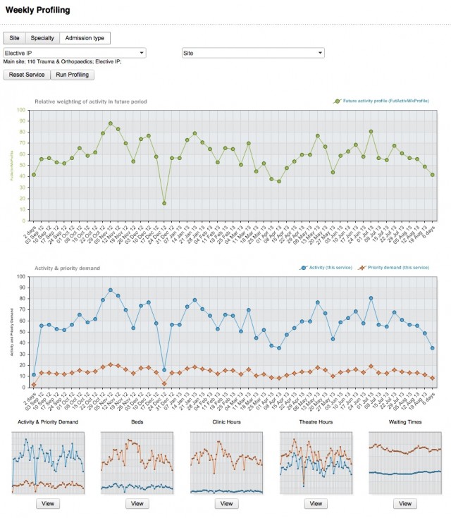
In this worked example the screenshots are taken from Gooroo Planner, where the Profiling screen looks like this:

The large top chart is the interactive activity profile, and we are going to edit this to reprofile elective surgery around the peaks and troughs in emergency and urgent demand. The large bottom chart is interchangeable by clicking for any of the thumbnails at the bottom, so it can show either activity and urgent/emergency demand, beds, theatres, clinics, or waiting times.
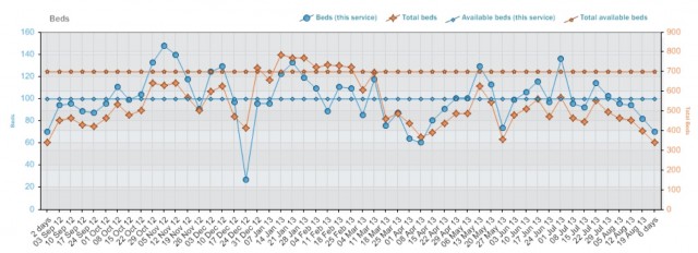
Let’s start by zooming in on the bed profile. We start this analysis using data that is based on last year’s demand profile and last year’s outturn activity profile. We’ve picked a major surgical service, and we’re going to see if we can reprofile it to stay out of trouble over winter.

The blue line shows the the number of beds used by our surgical service, plotted against the left axis, and the straight blue line shows the number of beds notionally allocated to this service. The orange line shows the total beds on our whole hospital site, plotted against the right axis, and again the straight orange line shows the physical on-site bed limit. Clearly, we are heading for trouble in January and February, where the number of beds required is far larger than the number available. Looking at the blue line, we can see that we are making things worse by scheduling so much elective surgery during the winter peak; the “red alerts” we experienced last winter are starting to look disturbingly avoidable.
So let’s start by reducing our plans for elective inpatients during the height of the peak. This is a simple matter of clicking and editing the points on the interactive top chart, to reduce the balance of work profiled during January and February until the editable profile looks like this:

After doing that, we get a bed profile that looks like this:

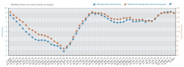
Much better. But what happens to waiting times as a result of this surgical slow-down? A peek at the waiting times chart reveals this:

The blue line shows waiting times just for the elective inpatient stage of treatment, and the orange line shows the RTT wait for this surgical service: that’s the wait for new outpatients, plus the wait for elective inpatients or daycases (whichever is greater). All waits are on a “90 per cent treated within” basis, so the orange line is comparable with the 18 week target. The bad news is that our waiting list is going to spike over winter, rendering the 18 week target unsustainable for 3 or 4 months.
We don’t want that to happen if we can avoid it. So let’s see if we can front-load some surgery to head off the problem. In real life we would have more than one surgical service to reprofile, but for the sake of this example we’ll try to do it all just with this one. So we’ll crack on with as much elective inpatient surgery as possible over the autumn, then slow down for as short a time as possible to keep beds just nicely full over the winter peak (but not too full – we are working to a target occupancy to allow for in-week fluctuations), and then pick things up again in March to deliver the balance of our planned activity towards the end of the year.
When we’ve finished editing the activity profile, it looks like this:

Now our bed profile looks like this:

That’s fine. Waiting times?

That’s fine too: we’ve front-loaded enough surgery to get the list right down before winter, so that even when it spikes we shouldn’t see any breaches. Then the balance of our planned activity is just right to bring us in on target for year end. (In a real hospital you would have several surgical services to play with, rather than just one, so this example is on the extreme side to illustrate the principle.)
That’s our profile done, then, from the comfort of late summer / early autumn. What are we going to do once the snow starts to fall?
Reacting to events during winter
Fast-forward to late January, and it’s cold. Emergency admissions shot up when the GP surgeries reopened after New Year; nothing unusual in that. But last week it shot up again and we had to cancel surgery. How does this affect our plan?
The first thing to consider is this: does this spike mean that the total amount of demand has gone up, or might this peak be balanced by troughs later on? Frankly, who knows? Overall the external demand for healthcare rises stepwise every few years, and if demand happens to have gone up just in the last week then that may mean something, or nothing. If you want to add an extra chunk of demand to your forecast then that is easily done but, if the end result is forecasts that are more volatile but no more accurate, then what is the benefit? Ultimately it’s your call, but a compromise position might be to update the demand forecast every month, not every week, to smooth the volatility out a bit.
On the basis of a week’s worth of data, then, let’s assume it’s a wobble in the profile not an uptick in total demand. We also have outturn data on the activity we delivered for electives, as well as emergencies. So let’s update both our demand profile and our activity profile with the latest week’s data and see where we stand now.

The loss of surgery means that we are now heading for a 21 week RTT wait at the peak in mid-March, whereas before we were expecting to peak at 18 weeks. Perhaps we should have allowed a bit more margin for error in our original plan. However if our assumption about demand (that this spike is likely to be offset by less demand at other times) is correct, then we should have capacity to bring in the displaced patients over the coming weeks to restore the position, as the revised bed profile shows.

And so it goes, week by week, month by month, until the days start to lengthen again. Forecasting demand is not an exact science, especially at a week-by-week level of detail, so our plans for winter are always going to have a large amount of guesswork mixed in with the logic.
In this worked example, January’s spike in demand caused problems with cancellations and the risk of waiting times breaches. That kind of thing is a risk unless we can provide a more substantial buffer in capacity (e.g. in the form of lower bed occupancy) to absorb the variation. Nevertheless, in this example we were in a much better position than we had been the year before, when we had been galloping merrily towards a severe, prolonged, and utterly predictable bed crisis before the winter had even begun.
This worked example was illustrated using Gooroo Planner with integrated week-by-week profiling; you can see a slideshow version of it here. If you are already using Gooroo Planner then profiling is available to you now: look for the profiling button at the top of the Reports view page. If you aren’t using Gooroo Planner already, and would like to take a look, then email info@gooroo.co.uk for a free on-site demo.
Return to Post Index