How to use week-by-week profiling in Gooroo Planner
21/10/2012by Rob Findlay
You don’t have to be technically-minded to do week-by-week profiling in Gooroo Planner, because it’s straightforward with a visual click-and-edit interface. So now senior and operational managers can take control of their own winter and seasonal planning, as in this worked example.
You can find video tutorials about profiling in our video section.
Because profiling is built right into Gooroo Planner’s reports, it runs off all the same data and assumptions that you (or your information analysts) have already loaded in and run through the model. So when you’re viewing a report, just click the Profiling button above any service to reach the profiling screen.
When you get there, you can choose how you want subtotals to be calculated for beds, theatres and clinics. In this example you want to see totals across the same hospital site as the service we selected (which, in which example, is the main site). So in this example you would use the right hand drop-down to ensure that only Site is ticked. When you’ve done that, the controls look like this:
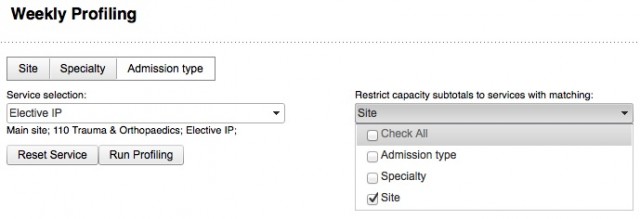
Under the left hand drop-down you can see the service you selected, and the right hand drop-down shows how subtotals are calculated. Now you’re ready to click the “Run Profiling” button, at which point Gooroo Planner will run profiling for all the services that are included in the subtotal, and display the full profiling screen which looks like this:
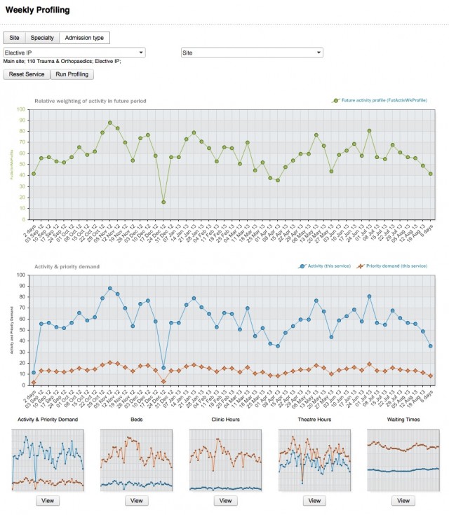
The controls you’ve just been using are at the top. Next there’s a big chart with green points on it, and you are going to click and edit this chart to change the profile. The values plotted in green are the weekly activity profile numbers that were loaded up into your original dataset. (If you just get a horizontal line here, then seasonal activity profile wasn’t loaded, so ask your information analyst to make sure the dataset includes the demand and activity profiles; see footnote for details.)
The lower big chart shows either activity, beds, theatres, clinics or waiting times, and you can switch between them using the View buttons under the thumbnails at the bottom. Whenever you change the profile using the top chart, the bottom chart and all the thumbnails are automatically updated, so the whole thing is interactive and immediate. (If any of the charts are blank, and shouldn’t be, then ask your information analyst to add the performance data needed to work them out; again, details are in the footnote.)
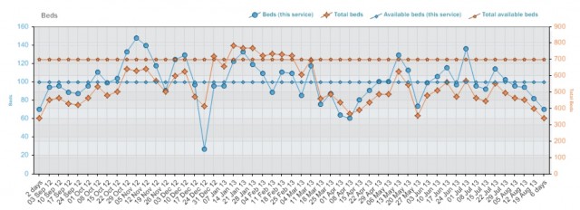
When you’re looking at beds, theatres or clinics in the bottom big chart (example below), the service you selected is in blue and plotted against the left hand axis, and the totals are in orange and plotted against the right hand axis. Having two y-axes can be a bit confusing at first, but you’ll get used to it; we had to do it this way, otherwise when the subtotals are big the blue line is really hard to see at the bottom.
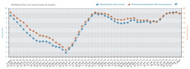
When you’re looking at waiting times (example below), again the blue line is the service you selected (normally just one stage of treatment) and plotted against the left hand axis. But now the orange total line (plotted against the right hand axis) is not subtotalled like beds, theatres and clinics. Instead it is the end-to-end waiting time for all stages of treatment that include this service, so is normally directly comparable with your referral-to-treatment waiting times target. In this example, for instance, the total waiting time for each week is the sum of the outpatient waiting time, plus the larger of the inpatient and daycase waiting times, for orthopaedics on the main site.
The activity chart (see the whole profile screen shown earlier) doesn’t have any totals on it. Instead, the orange line shows the priority demand for this service (plotted on the same axis as activity) and it’s there as a warning that you shouldn’t reduce activity so low that priority patients would be delayed.
Now that you know what you’re looking at, get stuck in and start changing your activity profile. It’s easy to do: just click one of the green points on the top chart, and a control will pop up that looks like this:
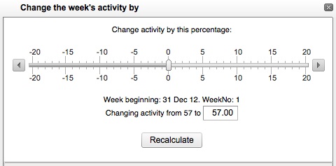
You can drag the slider or type a number into the box: whatever you find easiest. Then click Recalculate. (If you change your mind, just close the control by clicking the X at the top right.) All the charts will be recalculated to take in the change you just made to the profile.
Remember that the green chart is just showing the relative weights used for activity in each week, and the total amount of activity being done in the period does not change. So if you reduce activity in one week, activity will go up slightly in all the other weeks to preserve the total; similarly the waiting times trajectory through the period will change, but the final waiting time achieved at the end of the period remains the same. So the scenario you ran to create your original report stays the same.
If you want to save the changes you have made to the activity profile, then click the Save Changes button which appears after you start moving the green points around. Only the weekly activity profile in this report is changed, all other data (including the demand profile) remains the same, and no changes are made to the dataset that was originally used to create this report.
It’s really easy once you’ve had a play with it. So open up a report, click the Profiling icon, and have a go. You’ll be surprised at how readily profiling brings the numbers to life, and helps you plan for the future with greater confidence.
Footnote for information analysts
To get the most out of profiling, you’ll want your datasets to include enough data to work out beds, theatres and clinics, as well as week-by-week profiles for both demand and activity, for all services. Here is a typical profiling dataset template that includes all that.
When you start using profiling, if you want to get started quickly, you could just get your weekly activity profiles (FutActivWkProfile01 to 52) by counting the activity that was done in each calendar week last year. Gooroo Planner uses the ISO8601 definitions for week numbers but, to save you looking it up, week 1 began on Monday 3 January in 2011, and Monday 2 January in 2012.
Even better, smooth the activity over three years: just add up the activity in each calendar week over the last 3 years. Week 1 started on Mon 5 Jan in 2009 and Mon 4 Jan in 2010.
You can get demand profiles (DemandWkProfile01 to 52) in a similar way. For emergency services the demand is equal to the activity, so you can just copy the activity profile across. For elective services the demand is best measured using additions to the list (i.e. referrals for outpatients, and decisions to admit for elective inpatients and daycases).
Return to Post Index