Major upgrade to Gooroo Planner
04/07/2013by Rob Findlay
We have just released a major upgrade to Gooroo Planner that makes the Reports area (i.e. where you go to see the results of your planning) much easier to use.
The Reports area is Planner’s hub, particularly for operational managers, so ease of use is vital. I’ve been using the new version intensively (on our test site) for the last few days for a consultancy project, and really enjoyed the better navigation and higher productivity.
We hope you like it as much as we do. And yes, in case you’re wondering, it’s all available right now and at no extra cost. All you have to do is login to Planner as usual. That’s the beauty of web-based software.
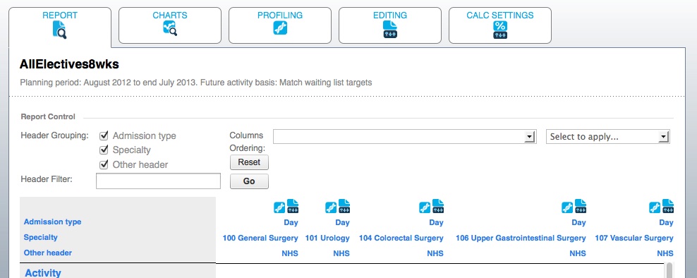
Tabbed Report area
The centrepiece is a new tabbed area for Reports, so that you can roam freely and easily around your planning.
From the main Report table (which lays out detailed plans for all your services) it only takes one click to go directly to any service’s week-by-week profiles, or to edit the assumptions that lie behind the modelling. When you move from one tab to another it remembers your settings, so when you come back you don’t have to reselect your sorting or filtering or which service you want to drill down into.
Export to Excel
This is something you’ve been asking for, and here it is. Below the main Report table is a new button: Export to Excel. With one click, it turns your whole Report table into an Excel (.xlsx) spreadsheet with all your formatting, sorting, filtering, subtotalling, etc intact. Much of NHS management virtually runs on Excel, and now it’s easier than ever to convert your Gooroo Planner modelling into your favourite spreadsheet format.
New Profiling tables
We’ve tidied up the downloadable tables of week-by-week profiling data, to match more closely the profiles you’re most likely to need, and dovetail with the DCAQ (Demand Capacity Activity Queue) programme in Scotland.
The new week-by-week data download now includes:
- Additions (e.g. referrals, decisions to admit)
- Demand (i.e. additions who will end up as activity)
- Activity (so you can monitor against outturn)
- List Size (also crucial to monitor against outturn)
- Waiting Time (on the same basis as your targets)
- …plus the familiar weekly results for beds, theatres and clinics
And it’s all calculated to reconcile back to the numbers in the main Report table that cover the whole modelling period.
Smarter look
To tie everything up in a big bow, we’ve also freshened up the appearance of Gooroo Planner with a smarter main menu, and a clearer and more consistent icon set. So it’s easier on the eye as well as easier to use.
Return to Post Index