Interpreting Capacity analysis: the Overview
08/04/2016by Rob Findlay
See also: the Detail | the Charts
The Overview lets you quickly see patterns in your theatre or clinic usage. Things like:
- When do sessions tend to start or finish late?
- When are sessions poorly used?
- When do sessions not happen at all?
- Could we avoid the expense of weekend working?
This post explains this powerful visualisation, so that you can quickly and expertly spot the opportunities to make better use of your theatres and clinics.
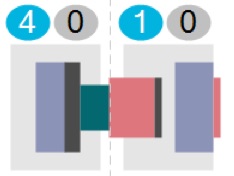
The Overview shows in a single view what happened, every day, over a period of many weeks. At its core is a visual summary of each day which works like this:
This example is for theatres; the view for clinics is just the same except there is no anaesthetic time, only turnaround time and clinic time.
Time runs horizontally, so for instance the view for each day might run from 08:00 until 20:00, with a dotted line at 13:00. You can change all three times by using a simple control above the main display.
The example above was drawn from the following data (omitting fields that are not directly relevant):
In the second column of data (TheatreSessionStart) we can see there were two sessions, one in the morning starting at 08:30, and one in the afternoon starting at 13:30. Each session was 240 minutes (4 hours) long.
The day began badly because the first patient didn’t start being anaesthetised until 09:39 (see TheatreAnaeStart for the first patient) – that’s more an hour after the session was supposed to start. We can see this in the visual above too. The left edge of the first grey box shows the session starting at 08:30. Then there is a gap of over an hour before we reach the left edge of the purple box, which represents the start of the first anaesthetic at 09:39.
The width of the purple anaesthetic box represents all the anaesthetic time for all the patients in the session – including anaesthetic times both before and after surgery. Then the green box represents the total of all the turnaround times between patients – that’s the time from one patient leaving theatre, to the next patient starting anaesthetic. Finally the pink box represents all the surgical (operating) time for all the patients in the session.
Now we have arrived at the right edge of the pink surgical box, which is the time the last patient in that session left the theatre. The morning session overran badly; we can see from the data table that the last patient from the morning session (the second-last patient of the day) didn’t leave theatre until 15:14 (that’s the TheatrePatientOut time), whereas the session was supposed to end at 12:30 (that’s the TheatreSessionStart time of 08:30 plus the session length TheatreSessionMins of 240 minutes or 4 hours).
As a result of the morning session overrunning into the afternoon, the afternoon session (which was supposed to begin at 13:30) didn’t get started until 15:50 when the first (and only) patient started being anaesthetised. That patient didn’t leave theatre until 17:49 (the right edge of the right hand pink box), which is a bit later than the intended session end time of 17:30 (the right edge of the right hand grey box). This patient had much more anaesthetic time than surgical time, and we can see in the data table that nearly an hour and a half elapsed between the end of surgery and the patient leaving the theatre (which accounts for most of the width of the purple anaesthetic box).
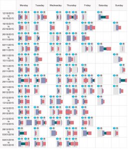
If this explanation leaves you thirsting for a more sequential visualisation of all the day’s events, then the Detail view is for you and it will be described in the next post; there are also summary performance charts available in the Charts view. But this summary Overview is still a useful way of seeing the patterns in different days of the week, because the format is compact enough to see the whole of several weeks in one go – as you can see if you click on the next figure:
Filtering the data
Above the main display there are also some filters, and you can use these to select particular services to highlight. The filters are responsive so that if you pick a particular specialty, for instance, then the filters automatically refresh so that only theatres which are used by that specialty are offered for selection.
For instance, here is the same example as above, but with only daycase activity filtered-in (you can also filter by specialty, or any other header in use such as hospital site or consultant).
The dark grey anaesthetic and surgery times in the morning session represent the elective inpatient which has now been filtered-out. The green turnaround times are left unchanged because of the difficulty in attributing turnaround time to different categories of patients.
Oddities
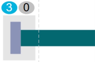
Sometimes you might see strange things in the Overview, and when that happens it is best to go straight to the underlying patient-level data to see what the cause is. For instance this is a data error:
The underlying patient-level data (which you can inspect via the Detail view) is:
The problem is the second patient, which doesn’t have valid times for the end of surgery or leaving theatre and this is causing a nonsense result. Obviously the best thing is to fix the data at source, but realistically this won’t always be possible so you may have to simply ignore odd-looking days when you come across them.
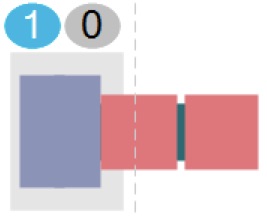
Here’s another data error:
In this case the second patient is duplicated in the data, which is causing havoc with the calculated display. This can happen if you are uploading theatre data on its own, without linking it back to the spell-based activity data, and a possible cause is the theatre data being at procedure level rather than patient level.
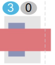
Here’s another one:
In this case the session is duplicated – the data contains two sessions starting in the same theatre at the same time, and this is causing overlaps and general nonsense in the display.
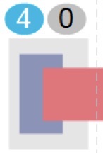
The next example, on the other hand, is more ambiguous:
Here there is negative turnaround time, so the surgical time box overlaps the anaesthetic time box. This is entirely possible in real life, for instance in theatres where a floating anaesthetist/ODP team takes patients to recovery, leaving the theatre-based team to start on the next patient; these negative turnaround times are shown as an overlap like the one above.
However when we look at the data table for this example, we can see that the final patient of the session overlaps the preceding patient almost completely, which suggests a problem with the data rather than deft theatre management.
Return to Post Index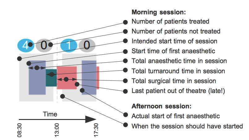





Leave a Reply
You must be logged in to post a comment.