RCEM: Bed occupancy – time for a new message
20/11/2019by Rob Findlay
The Royal College of Emergency Medicine (RCEM) kindly invited me to speak at their Policy Forum in Edinburgh on 19th November, and this is what I said:
Morning everyone, and thank you for inviting me here today.
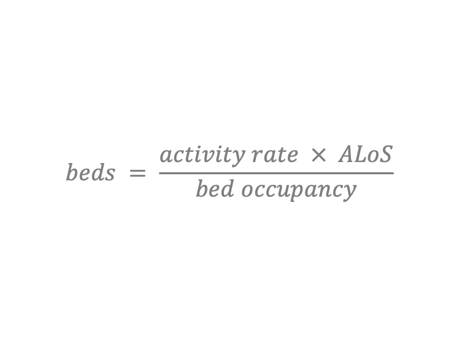
Has anyone seen this formula before?
This is the standard formula used for calculating how many beds will be needed in an NHS hospital.
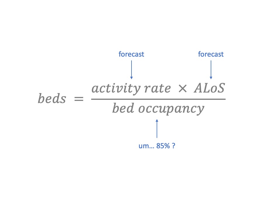
It’s pretty easy to use. You can measure and forecast the activity rate, based on admissions or discharges. You can measure and make assumptions about the average length of stay.
But what about bed occupancy? This is one of those numbers that “everybody knows”. The traditional value is 85%. So you plug in 85%, and – hey presto – you have calculated how many beds you need.
Unfortunately, the answer coming out of this formula is usually much larger than the number of beds you actually have (or can afford). So why not try 90%? Or maybe 95%? This is a fun game – you can carry on until the answer matches the number of beds you happen to have already.
That’s the “scientific” approach to bed planning. And a high bed occupancy also sounds really efficient, and shows how hard you’re working. [I’m joking of course…]
Why 85%?
This 85% figure, then. Who says 85% is the right bed occupancy?
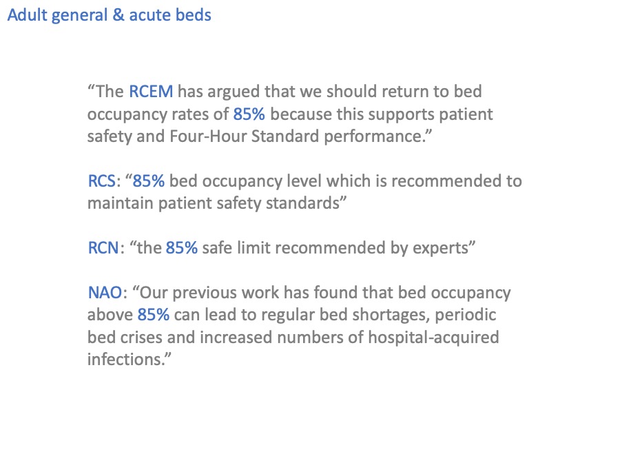
Well, you do.
And the Royal College of Surgeons.
And the Royal College of Nursing.
And the National Audit Office.
I should probably go home while I still can, right?
That last quote is an interesting one because it sounds as though they’ve actually researched this themselves, but if you follow the references back through their various documents, you end up at the same paper that every reference trail leads back to.
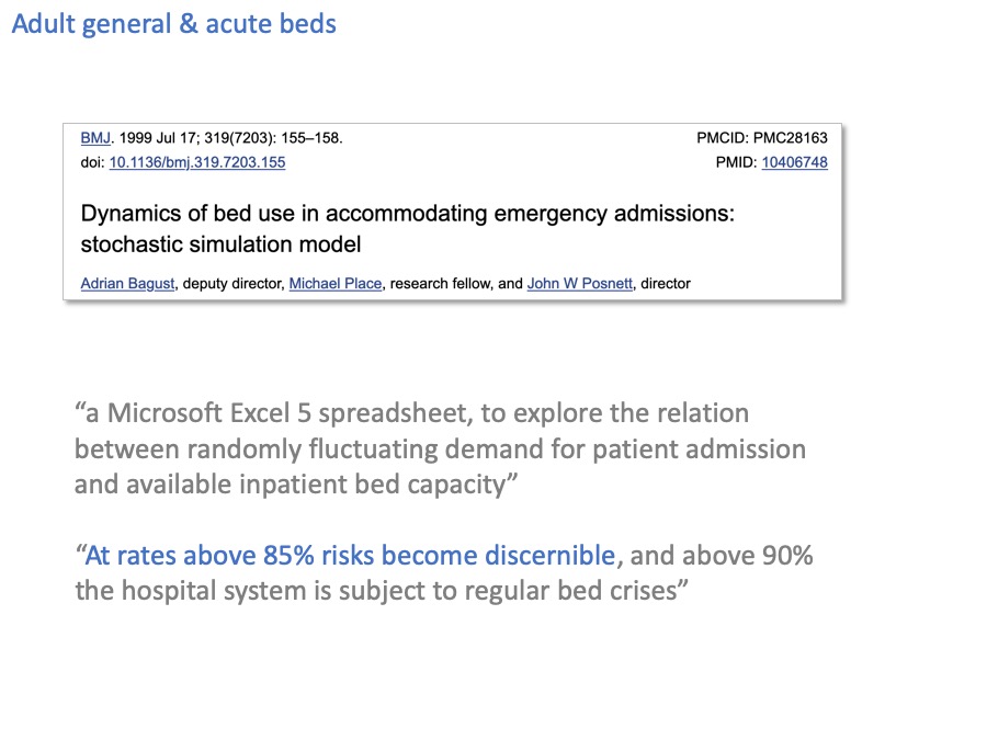
Bagust, Place and Posnett 1999, from the University of York. It’s a decent enough paper for the particular task it set out to do, and one of its main messages is that bed occupancy should not be 100% because some headroom is essential to allow for variation, which of course is absolutely correct.
But the problem is that its most famous conclusion – the 85% occupancy figure – has been generalised far too widely, as if it were a number that could apply anywhere.
Evidence from smaller bed pools?
Now I’ve been talking about adult general & acute beds so far, but of course there are other beds in the hospital too.
These smaller beds pools, interestingly, tend to favour lower bed occupancies; which makes sense, because a smaller bed pool is going to be more vulnerable to variation. This has been known since a Danish mathematician called Agner Erlang invented queueing theory a hundred years ago.
I wonder if the evidence base is any better for those smaller bed pools?
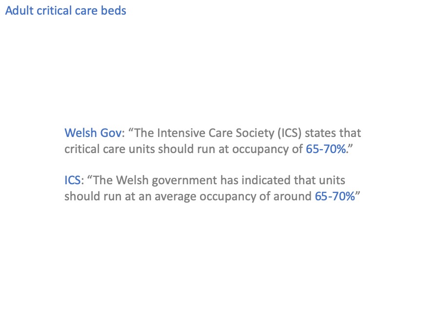
Ladies and gentlemen, I present a rare example of a perfectly circular reference.
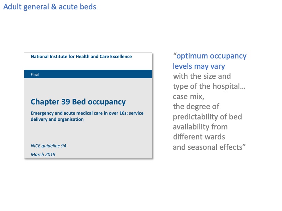
The National Institute for Health and Care Excellence, NICE, have also looked at bed occupancy and here at last is something that takes us a bit further forward.
“Optimum occupancy levels may vary”. Which makes complete sense. We’ve already seen how small bed pools like critical care beds are more vulnerable to variation, and need to run at lower bed occupancy, so what NICE say makes sense.
And this brings us to the case I am going to make.
The case
The case I am going to make, is not so much that 85% is the wrong answer, but that bed occupancy is the wrong question.
Instead (I will argue) we should focus on risk: the level of risk that we currently bear, and the level of risk that is acceptable.
I will show that risk is something we can start talking about now, and that risk can tell us things that bed occupancy cannot.
In particular, I will show that risk:
- provides a more solid and clinically-led basis for planning acute beds,
- is more helpful for evaluating potential solutions to overcrowded beds,
- and communicates the level of pressure better than bed occupancy can.
Risk and variation: week by week
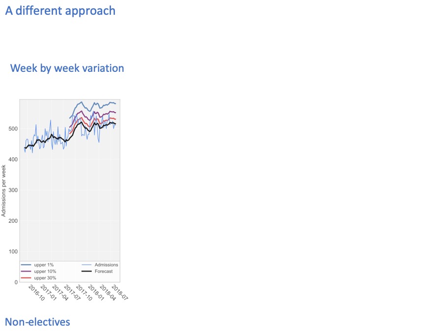
You’ll be relieved to hear that I’m not going to spend ages wading through the maths. But I will give you a quick outline of how it works, and if you want to look in more detail then I’ll give you a reference for the full write-up.
The numbers I’m using here are real numbers from an acute hospital, and these are non-elective patients only (in other words, broadly the emergency admissions).
Every week, the hospital admits a different number of patients. The pale blue line shows the number of admissions, every week over a two year period.
The black line in the middle forecasts the number of admissions, looking one week ahead at every step.
We train the forecast using the first year’s data, and then let it run on into the second year to see how accurate it is. The accuracy is shown by these coloured lines
The coloured lines show how unpredictable the admissions are.
30% of the time, they are higher than the red line.
10% of the time they are higher than the purple line.
And 1% of the time, admissions are higher than the blue line.
So if we only want to run out of beds 1% of the time, then our bed capacity needs to accommodate the blue line.
And to give you a flavour of how the calculations work… The definition of bed occupancy is: the number of beds that are occupied on average, divided by the number of beds available. On average the number of beds that are actually occupied is driven by the black line. Then if the number of beds we choose to have available is driven by the blue line (for a 1% risk of running out of beds), then the bed occupancy – by definition – is the ratio between the black line (the average beds occupied) and the blue line (the number of beds available).
So you can start to see how you can choose the level of risk you want (by choosing a coloured line), and then bed occupancy can be calculated from that as a technical exercise.
Risk and variation: hour by hour
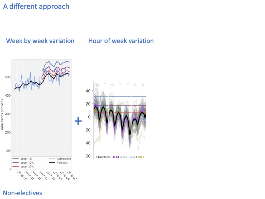
We also have variation on shorter timescales. Here, the heavy black line shows how, on average, the beds fill up and empty out during the week: Monday, Tuesday, Wednesday, Thursday, Friday, Saturday, Sunday.
There is a very strong daily cycle. That’s because admissions tend to be fairly steady through the day (except for a lull in the small hours of the morning), but chucking out time tends to be late afternoon / early evening. So non-elective beds tend to fill up in the morning and early afternoon, and then empty out in the early evening.
There is also a cycle through the week. Non-elective beds tend to fill up at weekends, because even though there are fewer admissions at weekends, there are even fewer discharges, so the beds tend to fill up so that Mondays are very difficult. The converse is that non-elective beds tend to empty out during the working week.
People get very excited about these strong average cycles, and believe that if only we could discharge more patients in the mornings and at weekends then we would solve a lot of our bed pressures. I’ll be putting that appealing idea under a cold shower a little later.
Because it’s the variation that really matters here, not the average pattern. Each of these thin coloured lines shows what an individual week looked like at this hospital. The difference between one Monday and another Monday, is much larger than the difference between the average Monday and the average Wednesday.
Again, we can draw risk lines on this diagram to show how full the beds are 30% of the time (in red), 10% of the time (in purple), and 1% of the time (in blue).
Risk and bed occupancy
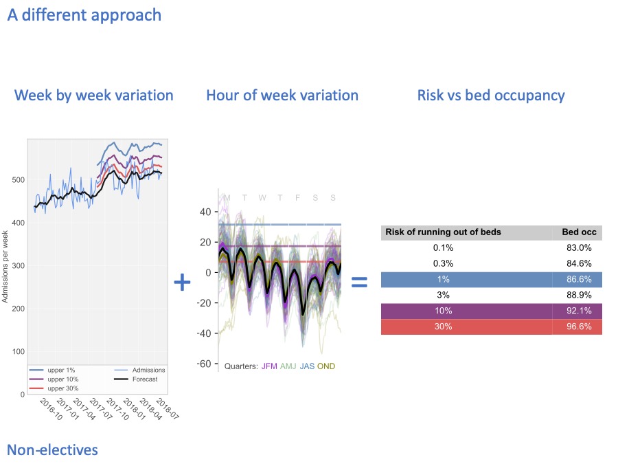
And when we combine those risks, we can come up with a table that takes account of all these timescales, to convert risk into bed occupancy. In this particular hospital, if we only want to run out of non-elective beds 1% of the time, highlighted in blue, then we need our bed occupancy to be about 87%.
This slide delivers on the first promise that I made to you: to demonstrate that we are now able to make risk the basis for discussions, because it is a technical exercise to convert that risk into bed occupancy (and therefore beds).

You don’t have to take my word for the method being used here. We wanted to make sure the sums were right before applying these methods, so we asked Professor Piotr Fryzlewicz (who is Deputy Head of the Department of Statistics at the London School of Economics, and a specialist in time series) to check through it all. And he’s happy.
And we also went through it in detail with the Emergency Care Intensive Support Team at NHS Improvement in England, and they kindly suggested we publish it jointly as guidance, which we have done. You can download a copy from the web address there.
As they say in the shampoo ads, that’s the science bit.
Every hospital is different
Now that we can relate risk to bed occupancy, let’s apply this analysis to some real hospital beds.
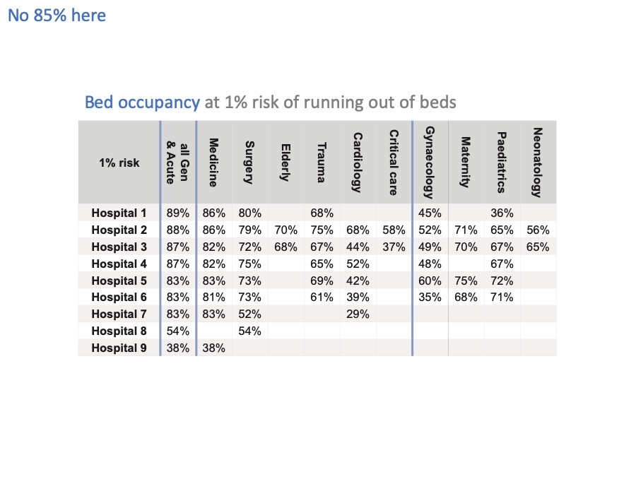
The first thing we find is that, surprise surprise, every hospital and every bed pool is different and needs to maintain a different level of bed occupancy – even if they wanted to achieve the same level of risk.
And they don’t want to achieve the same level of risk – for instance, running out of maternity beds needs to be a very rare event indeed.
Even if we just look at general & acute beds, there is a lot of variation from one hospital to another. Leaving aside hospitals 8 and 9, which are very small units, there is quite a bit of variation from 83% up to 89% bed occupancy across these hospitals, because of their different sizes and different patterns of admission and discharge.
These few percentage points might sound like fine distinctions, but the financial impact alone is pretty significant. If you have 400 non-elective beds, then a 1% change in bed occupancy is 4 beds. Let’s say each bed costs £400 a day. That’s £1,600 a day for all four beds. Which adds up to over half a million pounds a year.
Now I’ve slapped a 1% risk of running out of beds across the board in this table, but I’ve already caveated it by pointing out that 1% isn’t going to be the right level of risk everywhere.
So we need to unpack that risk assumption a lot better. And while we’re at it, we need to take account of elective beds in the hospital, as well as non-elective beds.
In short, I haven’t done a very thorough job of this so far. We need to work out how to apply this to a real hospital. Let’s do that now.
Applying risk to a real hospital
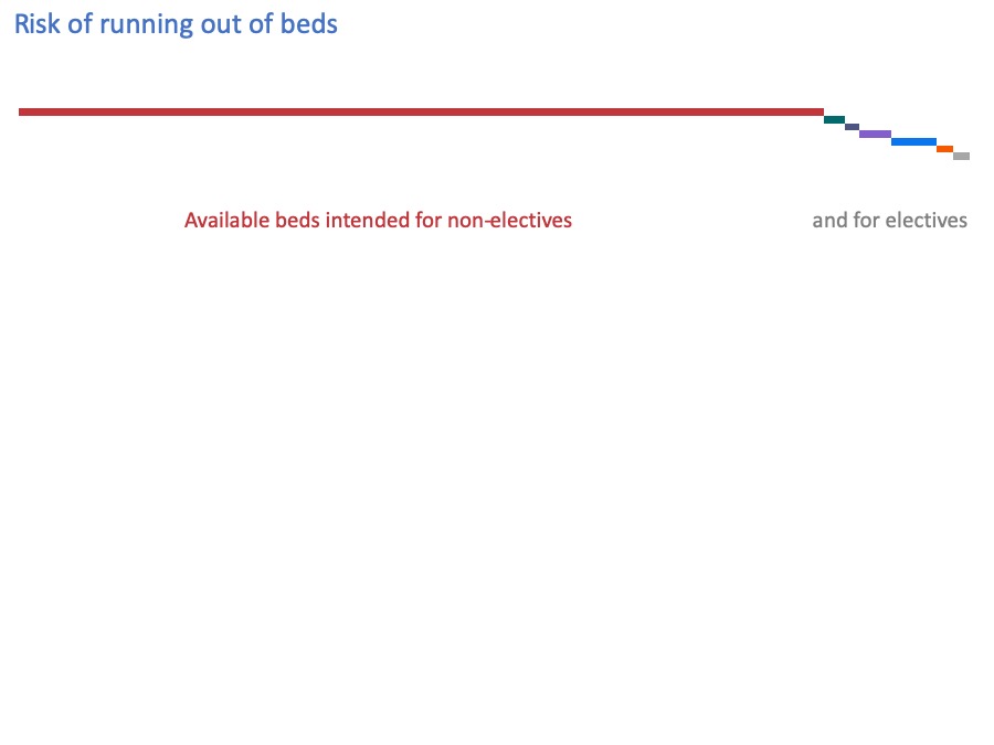
This diagram illustrates the beds in an acute hospital, and the kind of patient they are intended for.
The long red bar shows those beds that are intended for non-elective patients. In a typical general acute hospital, nearly all the beds are intended for non-elective patients.
Then these much smaller bars at the end are the beds that are intended for elective patients.
In real life these beds aren’t literally separated onto different wards, but for the purposes of this discussion it does help to differentiate them.
Now, the analysis I just showed you allows us to do something new with this diagram: we can superimpose, on this diagram, risk lines showing how often all these beds are used by non-elective patients.
In what I’m about to show you, I want you to keep two concepts separated in your minds:
firstly, what we intend to use these beds for; and
secondly, what we actually use them for.
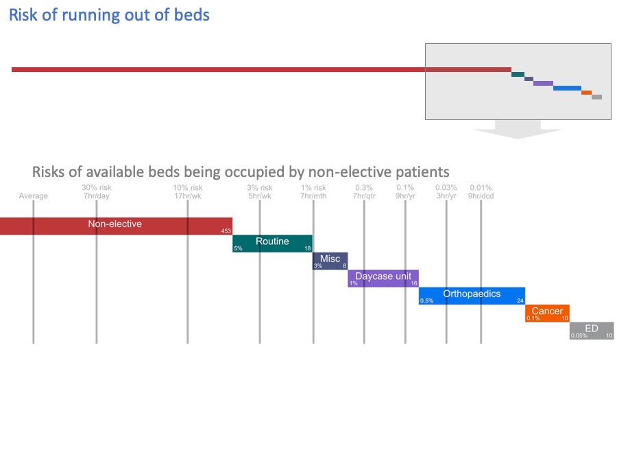
Let’s blow up this end of the diagram to see the detail better.
I’ve added grey lines, to show how often these beds get filled by non-elective patients.
You may not be able to see the numbers clearly enough so…
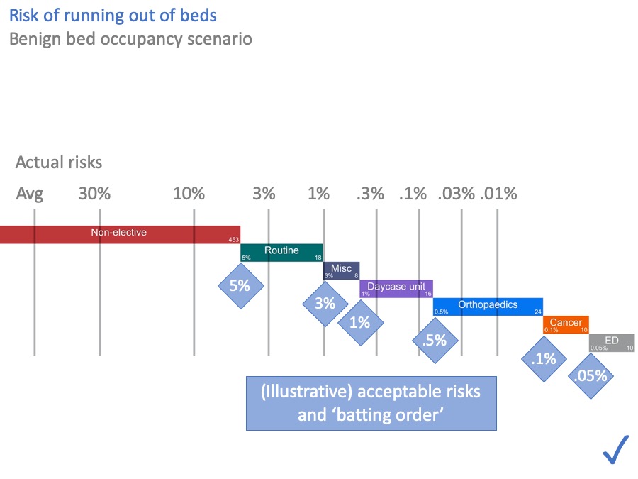
I’ve made them bigger for you in this slide.
The grey numbers above the grey lines are the risks of these beds being occupied by non-elective patients, calculated from the hospital’s own data using the method I outlined earlier.
On average, the “Avg’ line shows many beds are occupied by non-elective patients. But 30% of the time we need the number indicated by the 30% line, then there’s the 1% line, and so on.
Sometimes we can fit all the non-elective patients into our non-elective beds. But sometimes we can’t. There is a quantifiable risk that non-elective patients will spill out into our other beds.
Acceptable risk
Now let’s look at whether those risks are acceptable.
If we run out of non-elective beds, and more patients come in, then we need to put them somewhere. Where we put them, is something that needs to be agreed locally, and most hospitals have a winter plan that explains the escalation process.
For the sake of illustration, let’s use these figures (in the blue diamonds) as the ‘batting order’.
Usually, we try to make sure that non-elective patients are cared for in non-elective beds. (Actually we try to do better than that, and make sure that medical patients are in medical beds, and surgical patients in surgical beds, but to keep things simpler I’ll consider them together here.)
If all the non-elective beds are full, and more non-elective patients come in, then we might start by using beds that we’d hoped to use for routine surgery.
Why pick on routine surgery?
The conversation might go something like this.
First, what are the clinical and operational consequences of putting a non-elective patient in a routine surgical bed? There are several.
The non-elective patient might be on the wrong ward where the nurses are not skilled in their care, and some distance from their consultant’s usual wards and difficult to review as often.
The routine elective patient who was going to use that bed gets cancelled, which means they will wait longer, and it wastes the surgeon’s time and the theatre time set aside for their operation.
All those things are undesirable, and things we want to avoid. Is it life-threatening to cancel this elective patient? This is routine surgery, so presumably not.
All things considered, we might tolerate this kind of thing happening fairly often. Perhaps every week. Say, 5% of the time. So the end of this green bar, representing routine elective patients, has been marked with an acceptable risk of 5% that those beds might be used for non-elective patients instead.
Moving along to the orthopaedic beds… firstly we face all the same consequences as for the routine surgical bed. In addition, these beds are ring-fenced with an infection control cordon, and if we put a non-elective patient in there, then the whole ward cannot be used for orthopaedic surgery. It might take a while to deep-clean it afterwards, and get it back to orthopaedic use.
These consequences are more serious. We don’t want to face them very often, perhaps only a few times a year. So we might mark these beds with an acceptable risk of 0.5% of using them for non-elective patients.
Moving further to the right… Cancelling cancer operations is practically a ‘never event’, so that gets an even lower acceptable risk.
And I’ve put the Emergency Department at the end here. Although in practice it might be up at the start in many hospitals, ahead of routine surgical beds, but there are limits to how many patients you might want to board like that. So ED might appear more than once in this diagram.
Again, the acceptable risks in your hospital are up to you and your colleagues in surgery, but for the sake of illustration this diagram shows how it might look.
When you compare the acceptable risks (in the blue diamonds) with the actual risks (above the grey lines), you can see that this hospital does have enough beds. All the acceptable risks are satisfied. I’ve put a comforting blue tick in the corner to show that.
But most NHS hospitals today are not in that happy position. So let’s look now at a hospital that doesn’t have enough beds.
Unacceptable risk
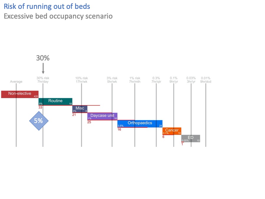
In this diagram, I have stressed the system by taking 33 non-elective beds out.
Now, the risk of breaking into routine surgical beds is over 30%. That’s more than six times higher than the acceptable risk of 5%.
The red line, and the red number, show that we are 33 beds short of achieving the acceptable risks. Which, not entirely coincidentally, is exactly the number of beds I just took out.
So we haven’t got enough beds. What can we do about this?
Possible solution: more beds
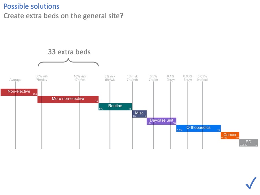
One option, of course, is to put the 33 beds back in. The NHS is awash with capital at the moment [another joke, obviously] … if only… So this option may or may not be available.
Possible solution: morning and weekend discharges
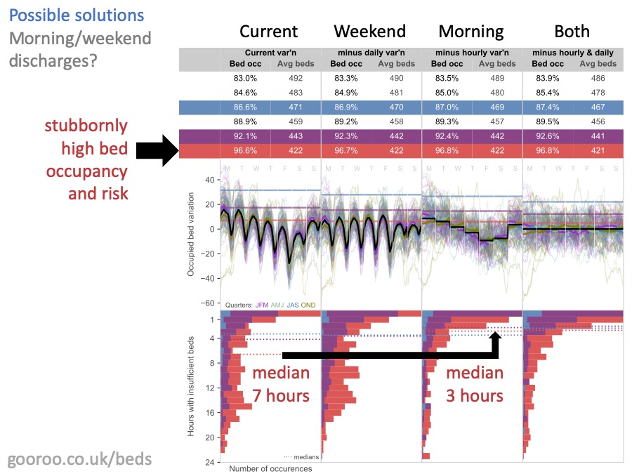
There’s a lot on this slide and you’ll be pleased to hear that I’m not going to go through it all. You can find the detail at this web address if you want it.
Remember earlier on, I was saying how people get excited about these strong regular patterns of average bed usage through the day, and through the week? And how they conclude that morning and weekend discharges might make a difference?
Well, here’s the cold shower I promised you. What this analysis shows, is what happens if you can increase morning and weekend discharges to match the average admission rates at those times.
The main thing to notice is that morning and weekend discharges – in themselves – make no meaningful difference to the risk of running out of beds. You can see that by looking at the bed occupancy numbers. The bed occupancy that is consistent with any chosen risk, hardly budges when you introduce morning and weekend discharges.
There is however one glimmer of hope. IF bed occupancy is ALREADY very high (which is what everything in red represents on this diagram) then morning discharges can help. They replace fewer, longer bed crisis, with more frequent shorter ones. Crucially, they bring most bed crises down to below 4 hours which helps with the 4 hour target in ED.
But, I say again, this does not reduce the overall risk of running out of beds in any meaningful way. And it only works if bed occupancy is already very high; if bed occupancy and risk can be lowered by other means, then there is no advantage in morning discharges when it comes to the risk of running out of beds.
(There may be other benefits from morning discharges, like the care homes being able to accept patients more easily, and length of stay being shortened by a few hours, but what I’m saying is not to expect the timing to create much relief on beds.)
So if reducing bed pressure is your aim, this analysis suggests that you shouldn’t spend a lot of time and effort on morning and weekend discharges.
Possible solution: moving surgery to a cold site
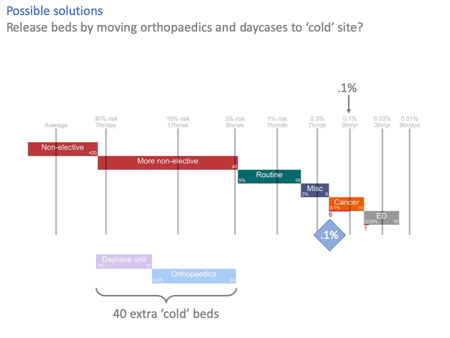
What about separating elective surgery out to a ‘cold site’, like an elective treatment centre?
The benefits of a ‘cold’ site are clear, certainly to the elective services lucky enough to go there. Surgeons love them. High throughput, low cancellation rates, without the constant disruption caused by unpredictable non-elective demand, interrupting the surgeons and occupying their beds.
But if we move cold surgery out, what are the knock-on effects for the ‘hot’ site?
In this diagram, we have moved day surgery and orthopaedics to a cold site, creating 40 new beds there. Their old beds have been converted to non-elective use on the hot site.
And it’s helped, but look at cancer. The risk of using cancer beds for non-elective patients is still higher than acceptable. We’ve created 40 extra beds here, and not quite fixed the problem.
A couple of slides ago, we created 33 beds on the general hospital site and we did fix the problem.
So in this example, a hot / cold split looks like an expensive way of not quite fixing the problem.
The numbers will be different in every case, and sometimes it may make sense. Orthopaedics on its own could be a good candidate for cold site working, because of the infection control requirement and the low acceptable risk of putting non-elective patients in there.
But you can see how this kind of analysis gives us a more complete view of the situation. Instead of only seeing the benefits for elective surgery on the cold site, we can also see the risks left behind on the hot site.
We wouldn’t have seen that, if we had just looked at bed occupancy.
Possible solution: admission avoidance and shorter length of stay
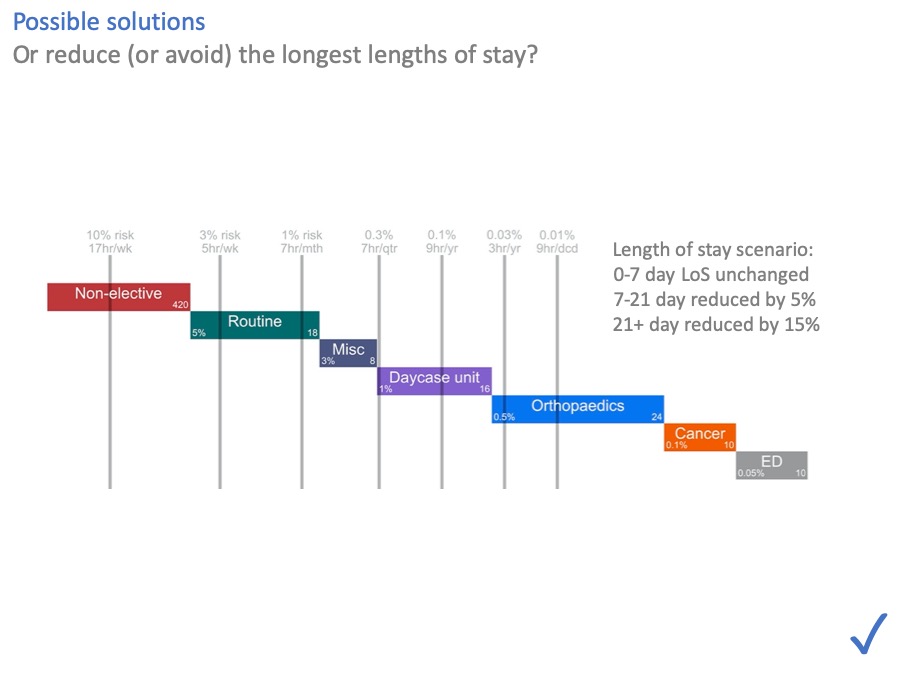
What about length of stay, and avoiding admissions in the first place? They help by moving the risk lines over to the left.
In general, anything that reduces admissions or lengths of stay is going to reduce bed pressure. And these numbers suggest that this, rather than morning and weekend discharges, is where the effort should go.
In this scenario we can see that even fairly modest reductions, just in the longest lengths of stay, are enough to make all the risks acceptable again.
Making short stays even shorter helps too. However I would observe that you have to do it with far more patients, to save an equivalent number of bed days. (So for instance, if you get somebody home today, who would have stayed another ten days, then you don’t have to do it again tomorrow. But if you get someone home today, who would only have stayed one more day, then you will have to do it again tomorrow.)
There are a lot of possible interventions wrapped up in this scenario, including community beds and care, hospital at home, social care, primary care… which I won’t go into, but the message is that any intervention that avoids admissions or shortens lengths of stay is going to have an impact.
A combination of solutions
We’ve looked at several possible solutions to these overcrowded beds.
In real life, you might combine several of these things together. Moving orthopaedics to a cold site, and creating an extra general ward, and avoiding some admissions, and reducing lengths of stay.
And at the end of all that, you might still not have achieved the levels of risk you wanted.
But you would still have achieved a lot.
Risks would be lower.
A rational escalation process would be in place – the ‘batting order’.
And the risks you accept would be an explicit part of the financial decision.
Communicating risk vs bed occupancy
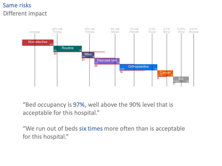
The last thing I promised you, was that risk could help with communication.
Let’s go back to our original scenario of excessive bed occupancy and risk, where we are 33 beds short.
What is a member of the public, or a politician, going to make of the 97% bed occupancy in that scenario?
97% is a big number. It’s bigger than 90%, or 85%. But it also sounds like it might be an efficient number: working hard, sweating the assets.
Now look at the equivalent statement expressed in terms of risk. “We run out of beds six times more often than is acceptable”.
Now you can hear the echos of chaos, of cancelled operations, and safari ward rounds. You can hear the scale of the problem: six times more, not a few sterile percentage points.
Conclusions
So in conclusion:
I hope I have delivered on the promises I made at the start.
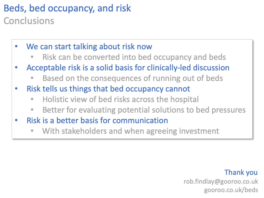
Firstly, that we can start talking about risk now, instead of bed occupancy. We can do that because risk can be converted into bed occupancy, and hence to beds, so we lose nothing by doing so.
Secondly, that risk is a better basis for discussion, particularly clinically-led discussion. We can start by describing the clinical and operational consequences of running out of beds. Then we can agree the ‘batting order’, for where non-elective patients should go when the non-elective beds are full. Then we can agree the acceptable risks of using different kinds of beds for non-elective patients.
All that is a much crunchier discussion than the comparatively weak evidence for bed occupancy.
Thirdly, risk tells us things that bed occupancy cannot.
We can put together a picture of bed risks right across the hospital, so that all the risks are visible.
When we are trying to reduce bed pressures, we can use risk to test whether our interventions are likely to be successful. And to make sure that, when solving a problem in one place, we aren’t creating a problem somewhere else.
Finally, risk is a better basis for communication. Instead of stating that bed occupancy (which itself needs a bit of explaining) is higher than some arbitrary-sounding benchmark, we can say more straightforwardly how often we run out of beds, and the consequences when we do.
That is not only more transparent for the tax-paying public, but it is also a clearer basis for evaluating the affordability of any investment in beds compared with alternative options.
And now, it’s over to you.
It’s you, and your colleagues, who live with these risks every day. You understand them better than I ever will. I may be able to help with the maths (and I’d love to), but in the end, the solutions will come from you.
Thank you.
Return to Post Index
Leave a Reply
You must be logged in to post a comment.