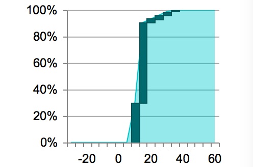
Interpreting Capacity analysis: the Charts
08/04/2016by Rob Findlay
This post has been superseded with the introduction of control charts in Gooroo Planner – please visit this page for an updated version
The Charts view gives you a statistical analysis of theatre and clinic usage on different days of the week, so you can quickly see where there may be opportunities to improve performance, or adjust the capacity allocated to each service.
There are four kinds of charts:
- Late starts: do sessions tend to start on time, or late? These charts take the intended start time of each session, and look at the delay before the first patient started being anaesthetised (or for clinics: before the first patient went in). With theatre time costing as much as £25/minute, can you afford any delays?
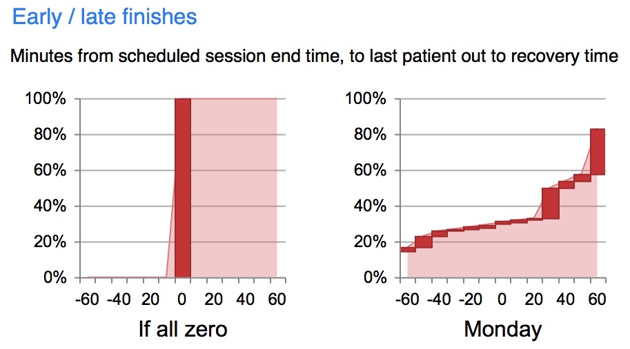
- Early / late finishes: do sessions tend to finish on time, or do they finish early or late? These charts take the intended end time of each session, and compare that with the time when the last patient left the room. Early finishes are usually preferred to late finishes, but not too early.
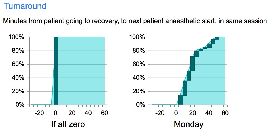
- Turnaround: how long is the interval between patients? Are they what you expected? These charts look at the time between one patient leaving the room, and the next patient starting anaesthetic (or for clinics: the next patient going in).
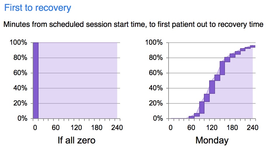
- First to recovery: when should recovery be fully staffed? These charts look at the time from the intended session start time, to the first patient leaving theatre. (For clinics this is called “First patient out”.)
All these charts are under the control of the date ranges and filters that you select in the controls above the main display.
Interpreting cumulative charts
The nice thing about cumulative charts is that they reveal what is happening beyond the limits of the axis. However some people find that cumulative charts take a bit of getting used to, so to make it easier (and using the principle that you should put the ink where the action is) we have superimposed columns to show where most of the data points are.
For instance, the chart above shows whether sessions tended to finish early or late (in minutes).
Starting at the left hand side, where sessions finished an hour early, we can see that the chart is already at 17%. That means 17% of sessions finished more than 60 minutes early – providing valuable information about those extreme early finishes without the need for a longer axis.
Then, focusing on the dark columns, a further 14% of sessions finished between an hour early and on time, making 31% in all that finished early.
There is a lot of dark ink at 30 minutes, showing that 17% of sessions finished between 20 and 30 minutes late.
After that it levels out a bit, before another tall column showing that 25% of sessions finished between 50 and 60 minutes late.
Finally the right hand side of the chart is still only at 83%, which means that the remaining 17% of sessions finished more than an hour late.
If you want to know which sessions they were, the Overview and Detail views can show you.
Now let’s look at each type of chart in turn.
Late starts
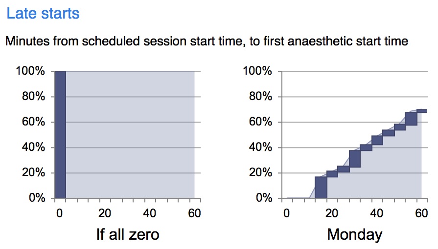
Each set of charts begins with an illustration of how the chart would look if everything happened at zero – for instance when it comes to late starts, “all zero” would mean that every patient started being anaesthetised at the intended session start time. For late starts and finishes, the “If all zero” scenario indicates an ideal; but that isn’t true of turnaround times and “First to recovery” where to a large extent it takes as long as it takes.
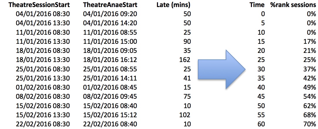
There are separate charts for each day of the week, and they are all shown together for comparison. The example above is drawn from the following patient-level data; and here only the first patients to be treated in each (morning and afternoon) session are used in the analysis.
The first two columns (TheatreSessionStart and TheatreAnaeStart) show the intended session start and anaesthetic start for the first patient to be anaesthetised in each session. The third column shows the calculated value of how many minutes late the session started.
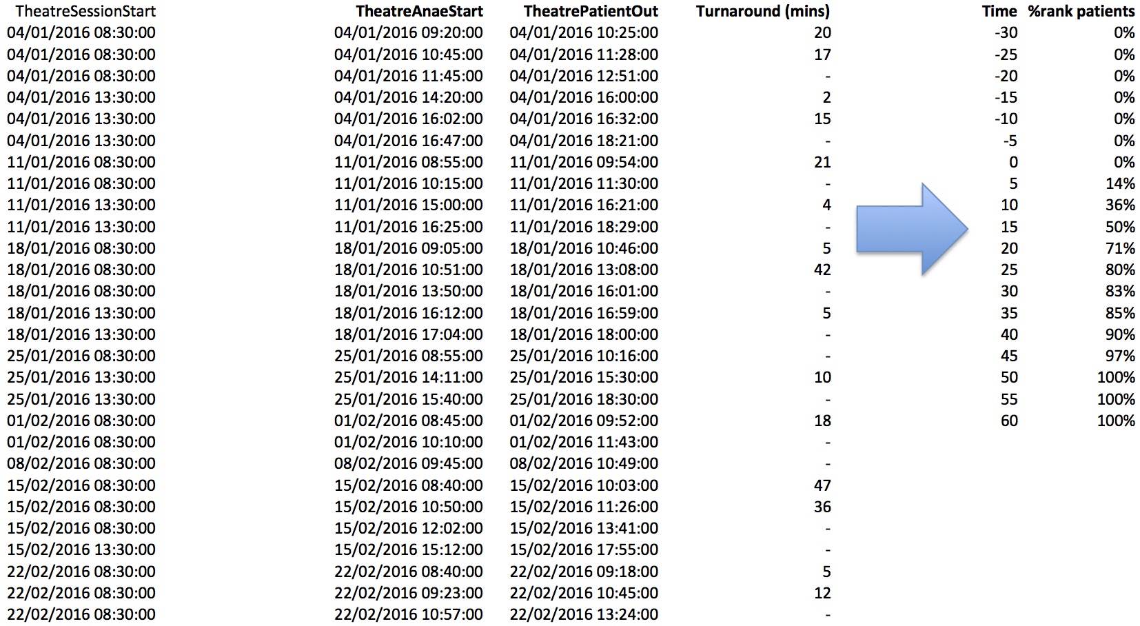
Then the sessions are grouped into cumulative 5-minute bands. If you’re interested to know the exact method, it is the same as Microsoft Excel’s percentrank function, which locates the “Time” value in the array of “Late (mins)” values. This method interpolates between missing values to produce a smoother distribution among sparse data.
Early / late finishes
The method is similar for early / late finishes. Here is an example chart:
…and here is the data and method used to calculate it. Only the last patient in each session is included in these calculations.
Turnaround
There is a lot more data to work on this time, because every patient takes part in the calculations no matter what order they were on the operating list.
Note that turnaround times are only calculated between patients that were in the same session as each other.
The scale on this chart extends into negative territory because negative turnaround times are possible. For instance some theatres might have a floating anaesthetist/ODP team to take patients to recovery, leaving the theatre-based team to start anaesthetising the next patient at the same time.
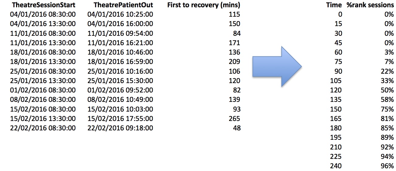
First to recovery
Taking only the first patient in every session:
There is no ideal time for the first patient to leave the room and enter recovery. The point of this chart is to illustrate when staff are likely to be needed in recovery. There is, after all, little point in having a fully-staffed recovery room from 08:00 if the first patient almost never reaches it until 09:30.
Return to Post Index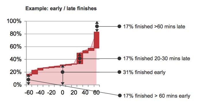

Leave a Reply
You must be logged in to post a comment.