More and better analysis of local ’18 weeks’ pressures
09/06/2016by Rob Findlay
We’ve upgraded our regular analysis of local ’18 weeks’ pressures, starting in full with the April 2016 data (published on 9th June).

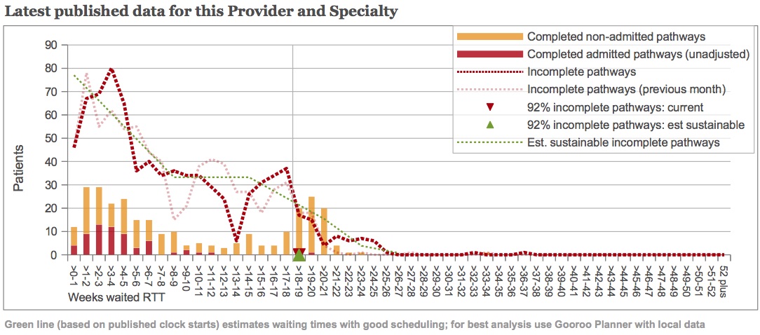
For example, take a look at the chart above – it illustrates a gastroenterology service, using March data. You can click on the chart to make it larger.
Comparison with previous month
As well as the end-of-month waiting list snapshot (dark red dotted line), there is also a fainter red line showing the previous month’s waiting list. So you can see how patterns move through the waiting list over time.
An obvious feature is the Christmas dip in referrals, which shows up at 8-9 weeks at the end of February (pale red dotted line), and has moved on to 13-14 weeks at the end of March (dark red dotted line).
New clock start data
Towards the end of last year, NHS England started publishing the number of RTT clock starts for providers. We are now using this data to assess more accurately whether waiting times could be reduced by improving patient scheduling. The estimated ‘well-managed’ waiting list is shown by the green dotted line.
The left hand end of the green line shows the weekly rate of clock starts, smoothed over the most recent four months. We use the published clock starts data whenever it is available, and then it says “(based on published clock starts)” in the text under the chart. If there isn’t enough clock start data then the text will say “(based on estimated clock starts)” instead.
You can use this to check the quality of your data. The green dotted line and red dotted lines should reach the left-hand axis at about the same height.
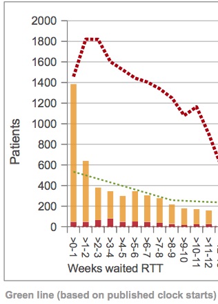
If they don’t, then there may be errors in your clock start data (an example is shown at the foot of this post).
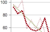
If they do, but the red line takes a dip near the axis (as in the example above) then you may have an administrative delay before your new clock starts are picked up in the incomplete pathways snapshots. This means that your measured waiting list may be too low, and so will any calculation of the waiting times you can achieve with good patient scheduling.
Clinical urgency in medical specialties
The green dotted line then falls quite sharply over the first nine weeks as clinically-urgent patients are treated. We are now using a choice of two methods to estimate how many patients are clinically urgent, depending on whether a specialty is more surgical or medical, and this should improve our estimate of the achievable waiting times.
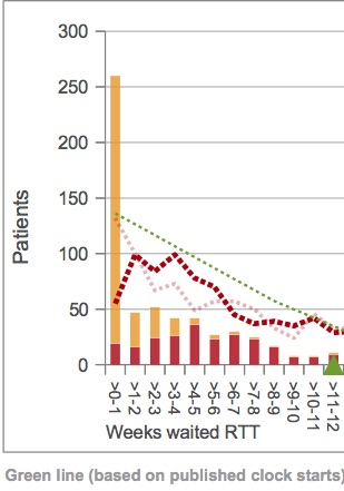
Patients are commonly admitted for treatment as inpatients or daycases in surgical specialties, so we estimate clinical urgency as the proportion of admissions within 9 weeks (the time was chosen to match the cancer RTT target). We ignore non-admitted patients in this calculation, because surgical specialties often show huge spikes in non-admitted clock stops at short waiting times. Because these spikes are often larger than the reported rate of clock starts (an example is shown at the foot of this post), it is difficult to have confidence that the non-admitted clock stops are always consistent with the other reported data.
In medical specialties, on the other hand, admitted clock stops are less common. And fortunately there isn’t much of a problem with strange spikes in non-admitted clock stops. So in medical specialties we estimate clinical urgency as the proportion of admitted and non-admitted clock stops within 9 weeks (and then the text about urgency that appears above the charts will refer to clock stops instead of admissions).
In both medical and surgical specialties, the proportion of urgent patients continues to be capped at the England median. This avoids results being skewed in services where the waiting list is small, and waiting times are short for routine patients as well as those who are urgent.
Waiting times achievable with good patient scheduling
Looking towards the right hand end of the green dotted line, the tail of this ‘well-managed’ waiting list is drawn the same way as before, taking account of typical levels of disruption to patient scheduling. The estimated 92 per cent waiting time – which should be achievable with good patient scheduling – is shown by the green triangle.
In the example above, this exactly matches the real-life 92 per cent performance which is shown by the red triangle. So here the analysis suggests that scheduling is already good in this gastroenterology service, and the 18-week breaches they are experiencing are caused by the waiting list being too large. Management action should therefore concentrate on capacity and list size, rather than on trying to tighten up scheduling any further.
More analysis of medical specialties
These changes have allowed us to extend our analyses to cover more medical specialties than before, so you should notice that more reports are available for your Trust or CCG.
We currently send out paper copies of these reports every month to Trust Chief Operating Officers, for each specialty that breached the 18-week or 52-week incomplete pathways targets. If you want to be the first to see the analyses for your organisation, then visit our 18 weeks report page the day after each month’s data release by NHS England – you can find their timetable here.
Please feel free to get in touch if you have any questions about these reports.
Examples of data issues


Leave a Reply
You must be logged in to post a comment.