Morning discharges and the 4 hour target
20/02/2019by Rob Findlay
In the previous article we saw that an increase in morning discharges makes only a negligible difference to the risk of running out of beds, and hence to non-elective bed occupancy. But this surprising conclusion is at odds with the experience of operational managers, who find that morning discharges do help to avoid 4 hour waits in the emergency department.
How can we reconcile these apparently contradictory positions? The answer lies in how long these periods with insufficient beds last, and whether bed occupancy is already very high.
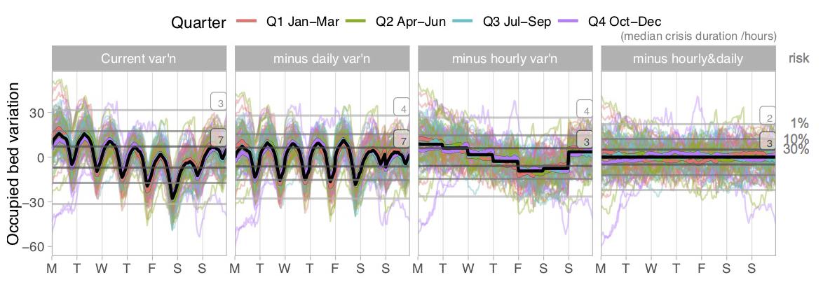
We have already seen the figure below, in the previous article. In brief:
- The black line shows how, on average, the number of occupied beds varies every hour of the week in an adult general and acute bed pool. Each of the coloured lines shows an individual week over a two year period. All the lines have been zero-based to isolate the intra-week variation.
- The left hand chart shows the actual position, and the other charts show the potential benefits of increasing weekend discharges, or morning discharges, or both.
- Finally, the horizontal grey lines shows how many extra beds you would need to lay on to have (from the top down) a 1 per cent risk of running out of beds, a 10 per cent risk, and a 30 per cent risk.
Look at the 30 per cent risk line (the third grey line down), which represents a bed occupancy of nearly 97 per cent in this example.
In the left hand (“current variation”) chart it slices straight through Monday and Tuesday. This means that if bed occupancy is so high that there is a 30 per cent risk of not having enough beds on average, then most of Monday and Tuesday will probably be spent with insufficient beds because they are the worst days. That means very long delays in accessing beds, twice a week, most weeks – a frequent and significant risk to clinical safety.
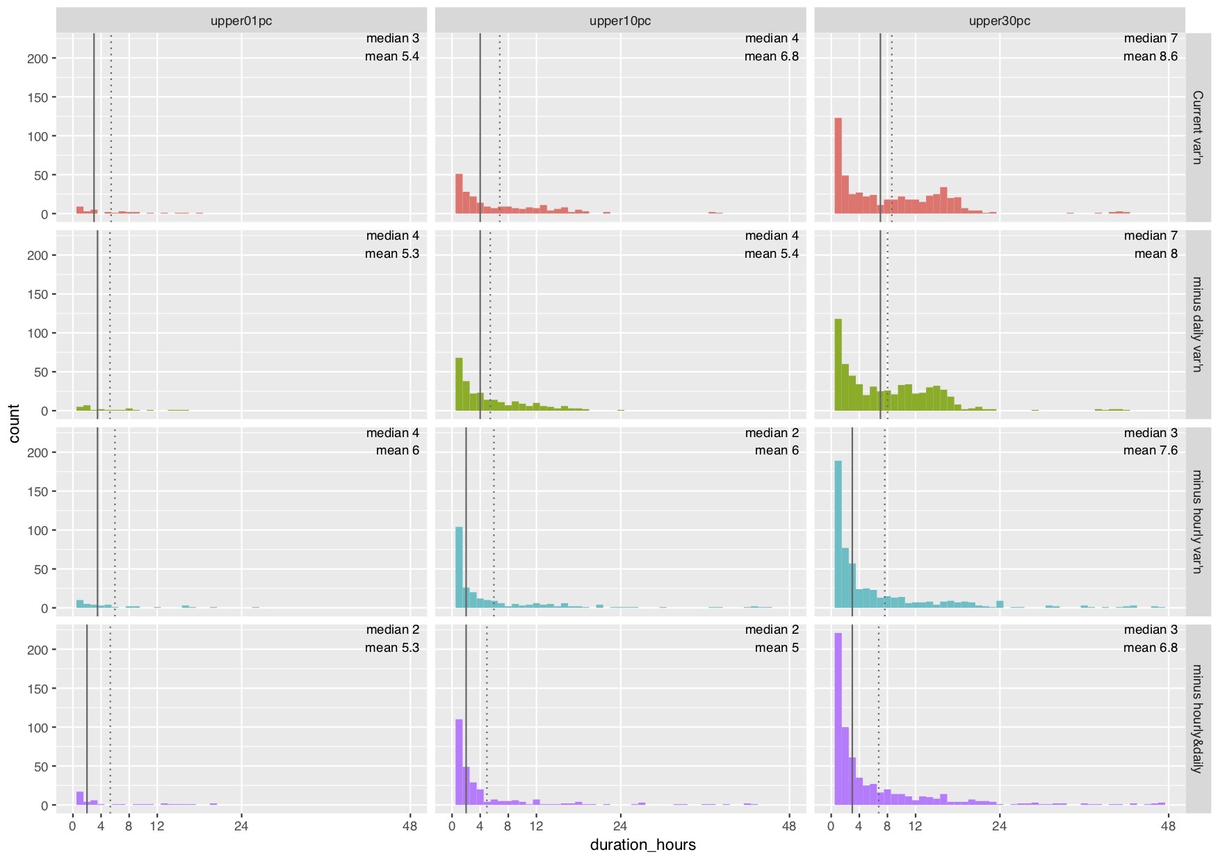
The array of charts below shows how long all the periods with insufficient beds last, under the various scenarios and risk levels. Let’s start by looking at the top right hand chart, which represents this very high bed occupancy scenario at the current patterns of variation.
High bed occupancy
This chart is a histogram. The horizontal axis shows the duration (in hours) of each period with insufficient beds. The vertical axis shows how many times those periods occurred in the two years of data (taking just the intra-week variations into account).
The spike towards the left of the chart shows that the most common period with insufficient beds was just one hour long. But the peak further to the right shows that there were also a lot of periods lasting more than 12 hours – like all those terrible Mondays and Tuesdays.
Looking down the right hand column of charts, we can see how the distribution of these durations changes as we test the various scenarios: from the current situation (in red, at the top), to increasing weekend discharges (green), to increasing morning discharges (blue), and doing both (purple, at the bottom). A big change happens as soon as morning discharges are introduced – the peak in over-12-hour periods with insufficient beds disappears, and they are replaced with a larger number of short periods.
This change is also reflected in the statistics marked on each chart below. The solid vertical black line is the median duration of periods with insufficient beds, so half of the periods are shorter than the median and half longer. Morning discharges have the potential to reduce the median from 7 hours to just 3 hours. (These medians are also shown as numbers beside the grey lines on the charts above.)
This matters because 3 hours is less than the 4 hour waiting time standard in the emergency department. If most periods with insufficient beds are less than 4 hours long, then these surges can be buffered in the emergency department without triggering large-scale breaches of the standard or the consequent clinical risks to patients. However if many of those periods last longer than 12 hours, as happens at present, then that is not possible and those very long waits come with significant clinical risk.

So far we have only looked at the right hand column of charts, which represents a 30 per cent risk of running out of beds (at nearly 97 per cent bed occupancy in this example).
Better to lower risk
What happens at lower risks? The middle column shows a 10 per cent risk (92 per cent occupancy in this example), and the left hand column shows a 1 per cent risk (87 per cent occupancy). At these lower bed occupancies the median duration of periods with insufficient beds is not above 4 hours even at current patterns of variation. Morning discharges make less and less difference as bed occupancy and risk are reduced.
So morning discharges are a useful ‘fire-fighting’ tactic to help reduce 4 hour (and longer) waits in the emergency department if bed occupancy is already very high. But they are not a strategic route towards a sustainably lower risk of running out of beds, nor do they make much difference if those risks are already lower.
I would like to thank the Emergency Care Intensive Support Team at NHS Improvement for their helpful suggestions during the preparation of these articles, Piotr Fryzlewicz, Professor of Statistics at the London School of Economics, for reviewing and advising on the statistical methods used, and those acute hospitals in England and Scotland who helped to pilot the methods.
We can calculate the relationship between bed occupancy and risk for your acute hospital – please get in touch if you are interested.
Return to Post Index
Leave a Reply
You must be logged in to post a comment.