Here are your referral-to-treatment trajectories for the next two years
05/12/2016by Rob Findlay
There never used to be quite enough data on referral-to-treatment (RTT) waiting times to do a proper forward look. No longer. The main missing item – RTT clock starts – is now published by NHS England and there is a full 12 months of seasonal data available. This is enough to feed into a planning model and generate future RTT trajectories by specialty and by trust. Which I have now done, and I’d like to show you the results.
The analysis itself was done using Gooroo Planner, and the results are all published here on Tableau Public for you to explore. For each specialty in each trust there are two scenarios: 1) what happens if they repeat last year’s activity, and 2) how they can spend the first year achieving the right size of waiting list to then sustain the 18 week target continuously thereafter.
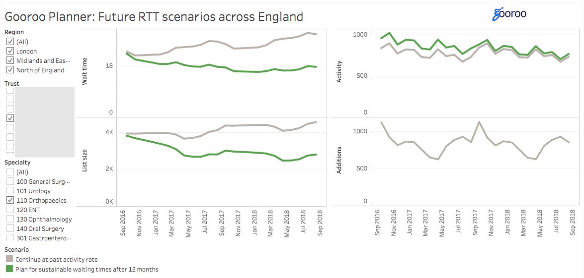
For instance, here is Orthopaedics at a particular trust.
Business as usual
The grey lines show what is expected to happen, if both activity and demand carry on as before.
Looking first at the two charts on the left, the bottom left chart shows the expected size of the waiting list (i.e. incomplete RTT pathways) under this “business as usual” scenario.
Then the top left chart shows the RTT waiting times that should be achievable with that size of waiting list, on a “92 per cent of incomplete pathways” basis. These waiting time calculations take into account clinical urgency, estimated removals, and assume reasonably good waiting list management, and are the same assumptions used in our monthly analyses of local RTT waiting times.
In this example, the model has worked out that the current waiting list is too large to sustain the 18 week target (and this particular service is also breaching the target in real life). Things are expected to get worse, as the waiting list gets longer and the achievable waiting times grow with them.
The charts on the right reveal the underlying dynamics. They show how activity (admitted and non-admitted RTT clock stops) and demand (additions to the waiting list, i.e. RTT clock starts) are expected to vary in future. When demand is higher than activity plus removals, then the waiting list gets bigger. And when more patients are treated than added, then the waiting list gets smaller.
For instance, additions to the waiting list take a dip in April and May, while activity continues at much the same rate; this results in a reduction in the size of the waiting list in those months. In August, on the other hand, activity is much lower but additions to the list remain high, so the waiting list gets bigger. And demand exceeds activity over the year, which is why the waiting list and waiting times are expected to get progressively worse.
(You may be wondering why waiting times do not rise and fall in synch with the waiting list. That is because it takes time for waiting time pressures to feed through the waiting list, so we smooth the addition rate when calculating the achievable waiting times.)
Sustaining the target
What can the trust do to avoid this gloomy fate? This is where the green lines come in.
In the charts on the left, the waiting list is initially too large to achieve the 18 week target. So for the first 12 months, the green line shows the waiting list being progressively reduced. By October 2017, it is small enough to rise and fall over the following year without ever breaching the 18 week target.
The charts on the right show how this scenario can be delivered. Demand, in the form of additions to the waiting list, is still assumed to repeat the historical pattern (the green line is concealed beneath the grey). Then the activity chart is the activity plan for this service: higher activity for the first 12 months to reduce the waiting list, then settling down to keep up with year-on-year demand thereafter.
The big picture
You can use Tableau Public to look more widely too, by selecting all trusts and/or specialties across a region. Then the charts show what is expected to happen overall, which might be helpful if you work at NHS England or NHS Improvement.
But there are a few things to watch out for. Firstly, waiting times don’t add, and the average waits in the top left chart are not weighted by list size. Secondly, the data only includes trusts which reported complete data over the last 13 months. And finally, these scenarios do not include any trend demand growth.
I hope you find these analyses interesting, and if you have any questions then please email me at rob.findlay@gooroo.co.uk. In future I will update these charts to show what actually happens as time goes by.

Leave a Reply
You must be logged in to post a comment.